Design for Growth
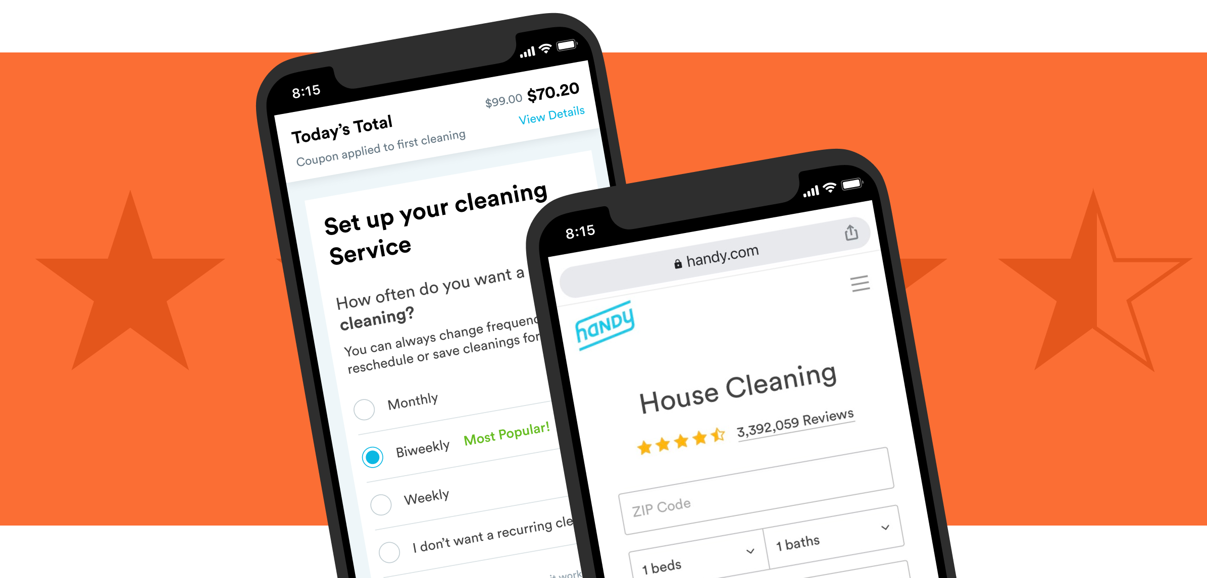

Handy is an online two-sided marketplace for cleaning and home services. One of its biggest revenue drivers is recurring home cleaning.
In order to offset high costs to acquire new customers, the product and marketing teams were tasked with the challenge of improving overall conversion. This meant coming up with creative ways to optimize the checkout flow to not only keep more customers on the Handy website but also convert them at a higher rate.
While the business problem we were tackling was relatively straightforward, the problem we were solving from the customer's perspective wasn’t so clear.
Reframing the problem from the perspective of the customer helped orient us toward solutions that would yield the largest impact.


As a new team member, it was important that I understood the cleaning landscape. Where do customers shop around for cleaning services? What are their mindsets when they arrive at Handy’s website? What are they most excited about and what deters them from booking?
My subsequent research can be summed up in four phases:
Identity drop-off points as opportunities for optimization
Understand mindset & Identify barriers to booking
Uncover problems with current flow
Understand competition, uncover UI trends
Most customers come to Handy’s website from Google, which lands them on what we call the When page. After entering basic job details, customers click ‘Get a Quote’ which takes them to the Payment page. Here, the price of the service is revealed for the first time.

As you can imagine, most first-time customers who land on the Payment page bounce (especially on mobile web). This could be for various reasons, like wanting to shop around for a better deal or not having a credit card on hand.
Identifying drop off points and contextualizing the data with qualitative user research (e.g. customer calls) helped us identify opportunities to engage customers more effectively through each phase of the purchase funnel.
of users drop off Payment page before completing a booking. Drop-off is even greater on mobile web.
Optimize Payment page. Optimize the Payment page (especially on mweb) to reduce drop off rate

of users return to the Payment page at least once within 14 days to make a booking.
Streamline Return Experience. Streamline the return experience for logged-out users to encourage customers to book

Whenever I could, I would reach out to customers at different phases of the purchase funnel (pre- to post-booking) to listen and understand their perspective. I also looked at CX tickets, read reviews on social channels, and regularly sent out email questionnaires to identify reasons customers either bounce or cancel their subscription early.
Across each feedback channel, common pain points emerged. I looked at competitors to understand how they tackle some of these pain points and created an affinity map to help my team visualize patterns and opportunities.

Since I was working off existing designs, I began my process by evaluating the current checkout flow to identify baselines for improvement. Specifically, I wanted to learn: are there usability issues that may cause confusion or hesitation? Do users’ expectations for a cleaning service align with the information presented to them? Are there lingering questions left unanswered?
Usability testing helped me better understand how users engage with the current checkout flow and identity some points of friction.
Throughout the initiative I took a bunch of competitor screenshots to help visualize the landscape. I looked at direct competitors as well as companies that sell subscriptions, like fitness classes and meal plans. One common pattern among competitors was multi-page checkout flows.
I found this to be interesting given the increased likelihood that customers would abandon their purchase with every added page. The multi-page trend suggests a clear benefit: customers likely prefer to be taken step-by-step through a checkout experience, allowing them to carefully think through their purchase and confirm all necessary information.

Both Product and Marketing created a roadmap of experiments which we tracked on a weekly basis. We performed a bunch of A/B tests aimed at optimizing the payment experience, from simple UI changes to a new user flow.
Below I summarize a few of those tests.

The team conducted a bunch of UI A/B tests, from urgency badges to small changes in form copy. The goal was to think of ways to make people feel better about their purchase decision using visual cues. Each small UI change aimed at improving trust and reducing risk.

Length: 2-weeks
Metric: Conversion via page CTR
Experiment: Experiment outperformed the control by ~3%


Length: 2-weeks
Metric: Conversion via page CTR
Experiment: Experiment outperformed control on mweb more than web. But we had to stop half-way due to legal concerns.


Length: 2-weeks
Metric: Conversion via page CTR
Experiment: Experiment did not outperform control by statistically significant amount.


Simple UI changes can only move the needle so much. What if we could create a shopping experience where customers could reserve a cleaning appointment without paying?
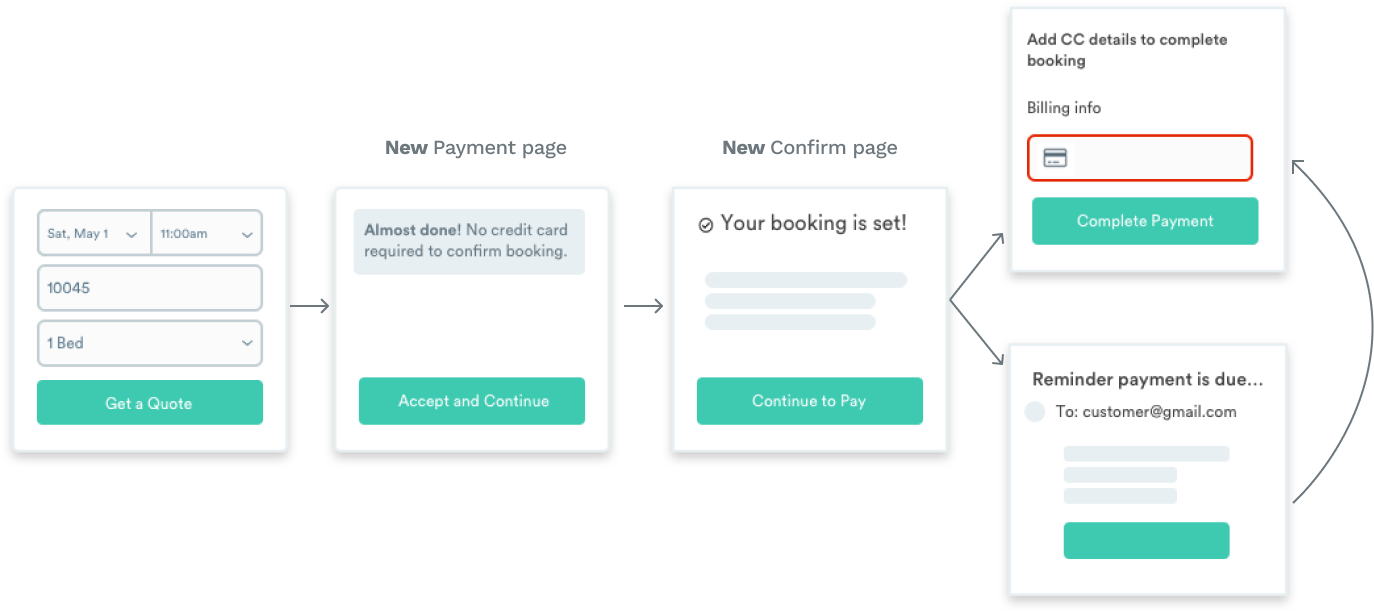
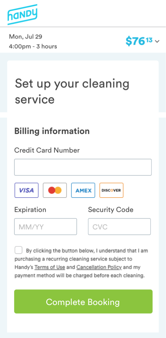
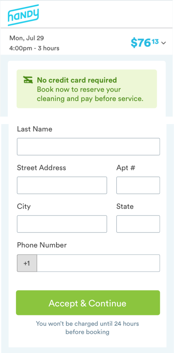
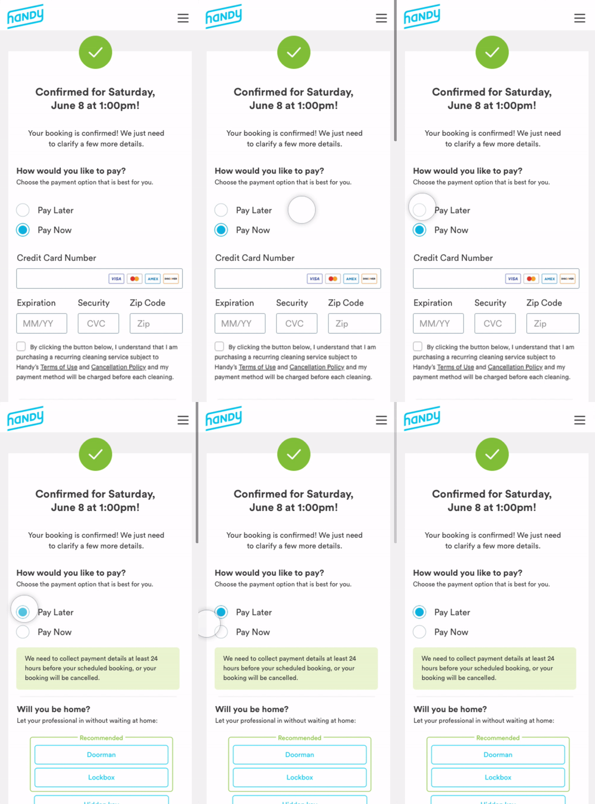
Under this new framework, customers would be given the option to pay now vs. later, and told that their booking would be cancelled if payment isn't received at least 24 hours before their scheduled appointment.
We wanted to learn just how customers would behave when the risk of making a booking was eliminated. While we expected more customers to book, we didn’t know whether or not customers would actually follow through or if they would simply reserve and flake.
Length: 4-weeks
Metric: Conversion via page CTR
Results: Experiment outperformed control in terms of initial bookings. However, a majority of reservations were cancelled due to late payment. 60% return later to rebook.
New Challenge: How to solve the over-cancellation experience?

Customers would be offered the ability to purchase a fixed amount of cleanings, which they could use at any time. Cleaning packs wouldn’t expire and customers wouldn’t need to worry about hidden fees. Meanwhile, the business would lock in guaranteed revenue from pack customers comparable to that of subscription customers.
A few years ago the company removed its one-time cleaning offering because it was no longer sustainable given the high cost to acquire new customers. As such, one of the biggest challenges our team faced was encouraging new customers to sign up for a subscription service without offering them a trial period.
Most new customers expect a more flexible option. The team brainstormed ways we could reposition subscription packs to be more flexible while also ensuring we achieved our revenue goals.
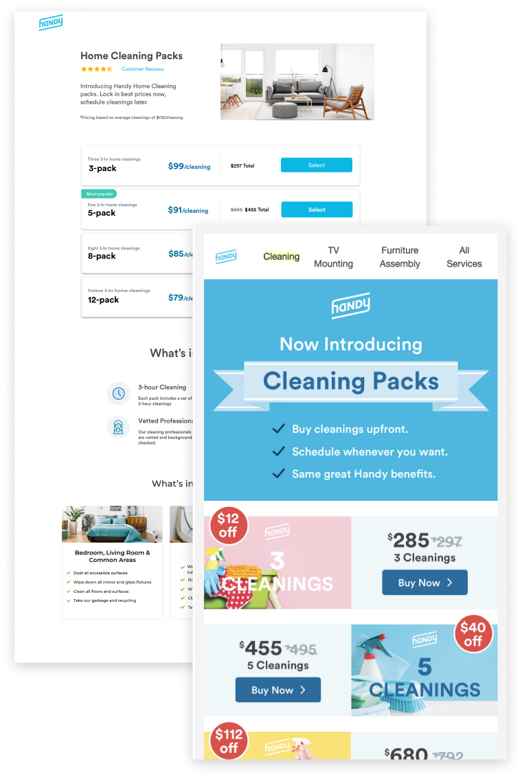
One approach would be to create a simple landing page using a templated tool (requiring no development work). The landing page would drive customers to a Shopify page on the Handy website where they could purchase cleaning coupons that correspond to the pack’s value. This would allow us to measure interest via click rate and conversion via payment.

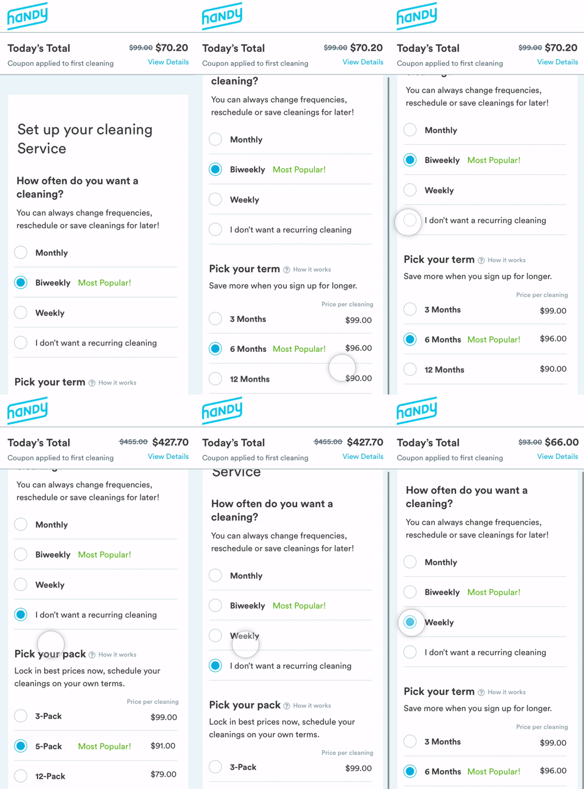
The other –albeit more risky– approach would be to offer packs alongside subscriptions on the Payment page. This would require more development work but would more directly test packs as a viable alternative to subscription plans.
The large price increase when the user selects “I don’t want a recurring cleaning” could serve as an anchor, rendering the subscription plan offering more attractive.
No single test can prove or disprove a hypothesis. Most of the tests were determined as inconclusive. This didn’t mean that our hypothesis was wrong but that we need more data / more testing to understand.
Take customer feedback with a grain of salt. What people say and do are not always aligned and it’s helpful to test strategies and assumptions even when you think they’re not likely to succeed.
Think like a psychologist. Understanding the customer mindset is absolutely necessary to improve business growth, and mindsets can change from day-to-day.
Designing for growth comes down to core principles of psychology and human behavior. We were challenged to put ourselves in the shoes of the customer and come up with creative ways to influence purchase behavior. However, in order to drive meaningful change, we would need to gain customer trust in our service and brand- which extends well beyond the checkout flow.